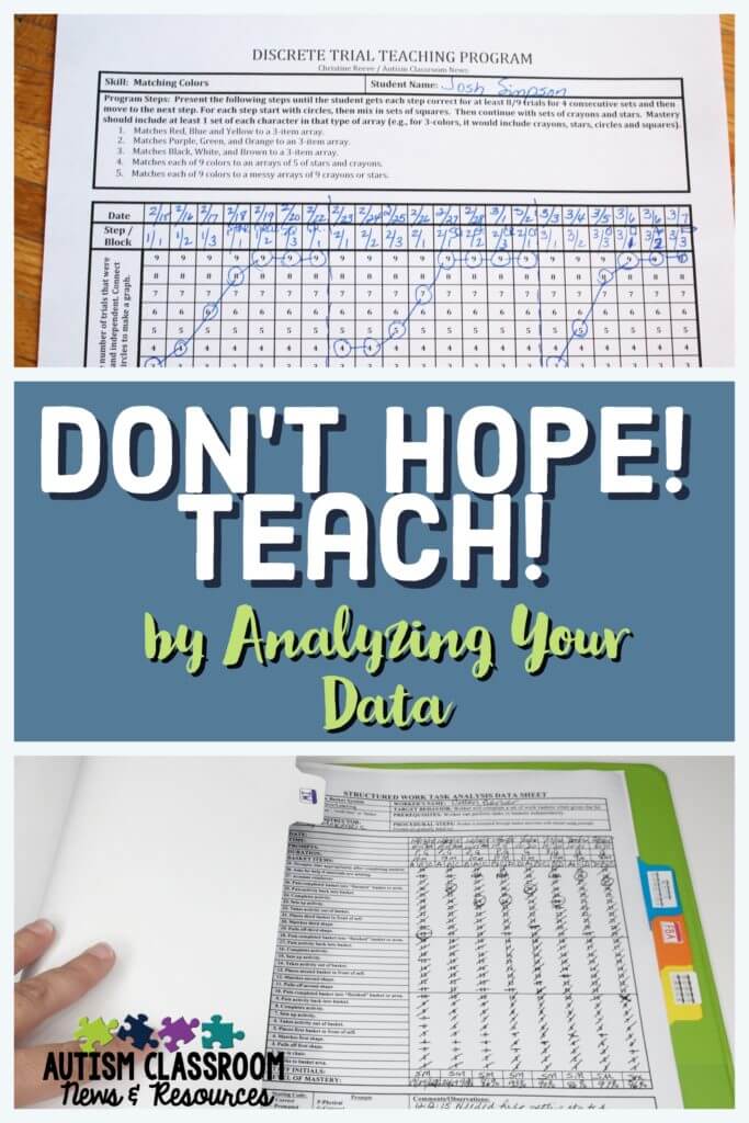
We take so much data in our classrooms…but do you analyze data? Do you summarize it and use it for educational decisions? That’s what we need to be doing to be effective.
Data is most effective when it is summarized regularly and reviewed weekly to determine if the student is making progress or if something needs to be changed. Many teachers will summarize the data for the progress report, but if a student isn’t making progress, letting 9 weeks or even 4.5 weeks for interims, go by without fixing it means you have lost ¼ year of teaching. There are two main roadblocks that I have found for analyzing and reviewing data regularly. First, finding the time to summarize and analyze it is difficult and it is hard to understand sometimes why it should be a priority among all the issues we have to contend with during a school day. Second, teachers are often unsure how to summarize and make decisions about it. Today I want to talk about some contributing factors to these two issues and some solutions.
[socialpug_tweet tweet=”We take so much data in our classrooms…but do you analyze your data? #ABA #eddata” display_tweet=”We take so much data in our classrooms…but do you analyze your data?”]
Why is Summarizing and Analyzing Data Important
 Research
Research shows that teachers who graph their data and review it weekly have students who perform better and learn
faster. Think about that…not only are they better teachers because of it, their students feel the impact. To me, that’s a great reason.
Don’t Waste Your Time
Why take data if you aren’t using it? Data is taken for a variety of reasons but data that is taken and put in a notebook never to be seen again is just paperwork. I don’t know about you, but I hate paperwork. I especially hate paperwork that is just paperwork and serves no meaningful function for me. That’s not what data should be. Data should be useful and functional.
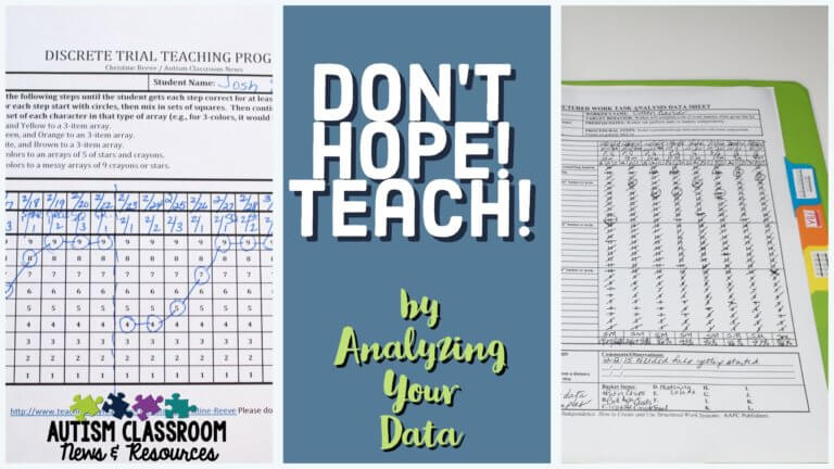
Hoping Instead of Teaching is Insanity
The old saying is “The definition of insanity is doing the same thing over and over and expecting a different result.” If you don’t take data or don’t review data you take, essentially you are doing the same thing over and over and expecting that eventually the student is going to figure it out. That’s not teaching…that’s hoping. Hoping is wonderful but it’s not the job of the teacher. If you don’t review the data then you could just be doing something repeatedly with no results and not know it—hence insanity. Reviewing the data every week means that you catch problems early and change what you are doing, giving the student the opportunity to make progress more quickly and you the opportunity to either make changes to teaching or changes to the goal.
It’s Reinforcing!
Finally, I am a self-admitted data geek—see this post here—but surely there is something incredibly reinforcing about seeing a student learn and watching a graph of data rising upward to meet the goal to me is the visual of that learning. I love it and once it becomes your habit, you can love it to. OK, maybe that’s a little strong, but at least you can “not hate it.”
So, How to Help….
Analyze Data Regularly
Get in the habit of reviewing all the students’ data weekly. Whether it is easier to review 2-4 students a day or all of them one afternoon is up to you. You have to keep with this and do it for a few weeks before it becomes a habit. Keeping up with it also means no more all-nighters before the IEP meeting or report cards. A habit takes time to develop so when you start commit to doing it for a month and then see how you feel.
Do Group Analysis
No, I don’t mean group therapy…although some of us may need it when it comes to just thinking about data. I mean, establish a group—the team—who work with the student and set up a time to review the data weekly. If you are lucky enough to have assistants stay at the end of the day (or come in before school starts), have them help. We tend to think that data review is only the teacher’s job. However, what better way for everyone taking data to understand it’s importance than for everyone to participate in regular review of the data collected. At one school, where the paraprofessionals were there at the end of the day, we established Data Thursday. No meetings (IEP, faculty, staff, etc.) were scheduled for Thursday afternoon specifically so that each classroom team could summarize the data. Some broke it up and each person took some of the students’ data to review. Some had one person read it off and another person graph it. Whatever works is fine, but the paraprofessionals reported enjoying it because they saw the fruit of their efforts. In other situations, we have swapped bus duty with the neighboring classroom one day a week (we cover their’s one day, they cover ours another) to allow meeting time within the time we have to review data.
Graph the Data
I know it feels like you can see how things are going by looking at the numbers, but a graph does it much better. A graph also easier to share with others to see what is happening. And remember that you are taking data on either every occurrence or a sample of every occurrence of behavior, so it’s lot different than having one data point a day that represented what you thought the progress was. So there is more data to look at. Somewhere, and I really wish I remembered where, I recently read that 3 points can be reviewed in a table, but any more than that really requires a graph. Graphing the data lets you look at how variable the data is; whether it’s getting better, worse or staying the same; and whether progress was being made but now is plateauing. All of these patterns tell us different things about what we should do in our teaching.
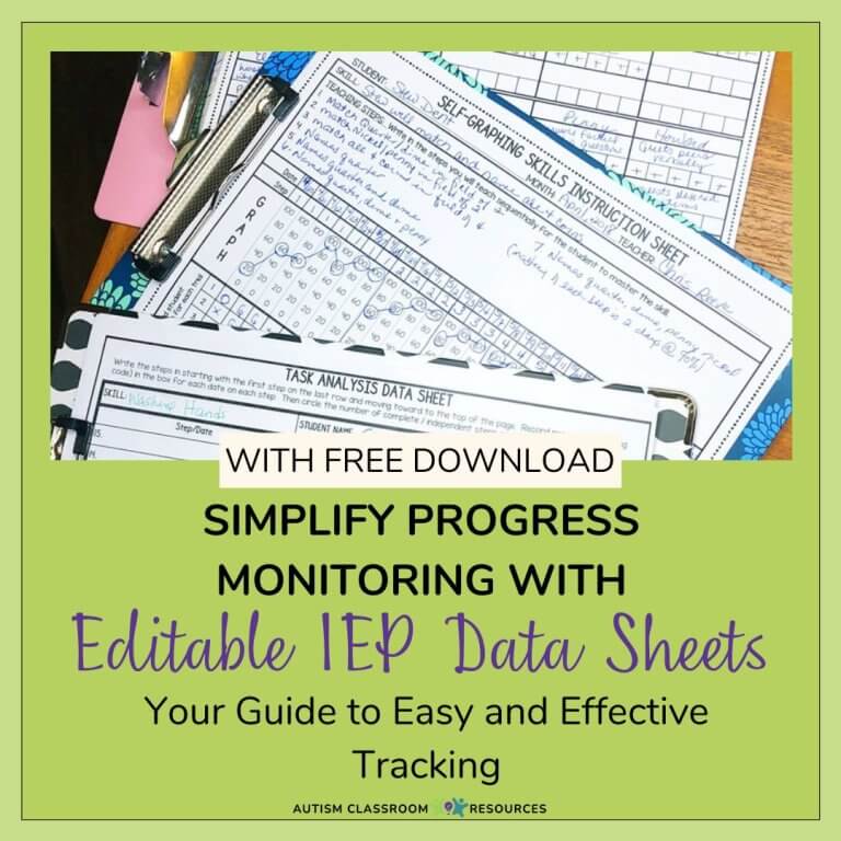
Graph As You Go
Another option is to use a self-graphing data sheet or to graph the data on graph paper (or the iPad, or computer) as you go at the end of each session or each day. I use a self-graphing data sheet that will be part of our data collection book that I reinforce myself with by graphing to see the student’s progress (remember, I’m a geek so I find this reinforcing; your experience may vary). Gabrielle over at Teaching Special Thinkers has
a great tutorial on using Google Docs to take and graph data as you go.
Ok, if I can regain enough of my voice,
my next post will actually be a video tutorial using Excel to graph the data from the naturalistic data sheet I shared with you in the past. In the meantime, I’ll tell you a secret. You can
click here for a PowerPoint handout on data collection that includes hard copies of data sheets. They are just some of the data sheets being prepared for the book so I can’t make them editable at this time, but hopefully they will give you some ideas of what to try.

 So, until next time, how do you analyze your data? Want more information about data collection and organization? Check out our book Taming the Data Monster. That’s an affiliate link which means you get the same price and I make a small commission.
Until next time,