Did you know that graphing data for data-based decision making improves your students progress? That’s right, teachers who graph their data have students who make more progress. Yep, that’s what the research says. And of course I’ve said it before. But how and when do you fit this into the day with everything else you have to do?
Graphing Data Easily
Actually it doesn’t have to be hard, but it does need to be a system that is completed consistently. You can graph your data and analyze it weekly to see if students are making progress or if you need to make changes.
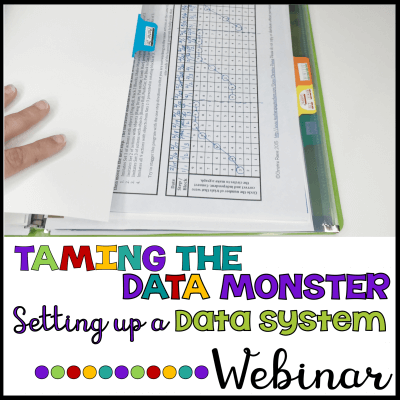
Yes, I hear the sighs now…but really, I’ve got some tools that can make it easier. I promise. On previous posts I shared a FREE naturalistic data sheet for taking regular data samples. You also got this data sheet if you have taken my FREE webinar on Setting Up a Data System for your classroom.
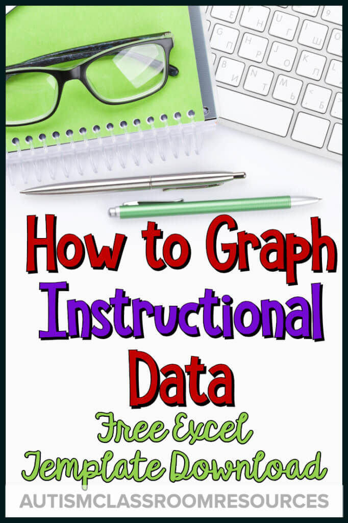
You can use that data sheet with the free Excel spreadsheet in this post to input your data and it will MAGICALLY (or as magical as I can get with excel which isn’t that magical) graph it FOR YOU! If you have used this tool before, I’ve since updated for the 2019-2020 school year!
And Even Easier

And to make it a bit easier, I’ve even made a tutorial to help you use it for graphing data regularly. This is a Quick Win I created for the Special Educator Academy, but I’m sharing it here to help you see how the Excel spreadsheet can help you with graphing data on instruction in order to analyze it.
The naturalistic or group data sheet shared above gives you weekly samples of the student’s performance. But you then do have to take the data off the data sheet and summarize it in some way. This tutorial can help with that.
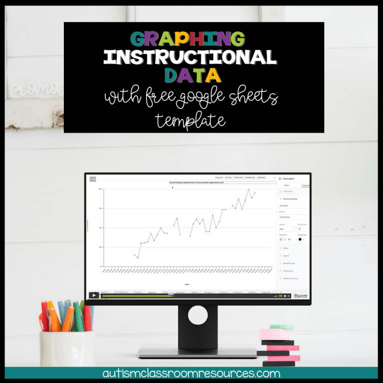
To help you with graphing data for your classroom, I have created a spreadsheet on Excel and Google Sheets. It allows you to input data on correct / independent responses and total opportunities to graph the weekly progress in percentage of correct responding. This allows you to look at the trend to see if the data is headed in the correct direction and whether it is aimed at meeting the goal.
Grab the Google Sheets Version Here
Sign up for free tips each week in your inbox and grab the Free Excel Download from the Resource Library
I try to assure this gets updated every year. It will graph a year of data and the video below will walk you through exactly how to use it.
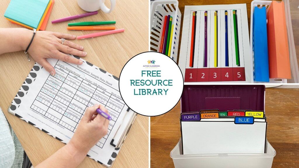
Grab it from the Free Resource Library. Click below to navigate or join the free library.
To help show how to use it, I’ve broken out this Quick Win from the Special Educator Academy to walk you through how to use it. And if you are a member of the Academy or trying it out in our free trial, there is a quick win on instructional data decision making with a tool you can use to analyze the graph and make sense of what to do or try.
I’ve also created a document you can download with screenshots and notes on how to use it.
And if you liked this quick win, you’ll love our courses and more quick wins in the Special Educator Academy.